Houzz Pro Spotlight: How to Use Light and Space to Transform Your Home
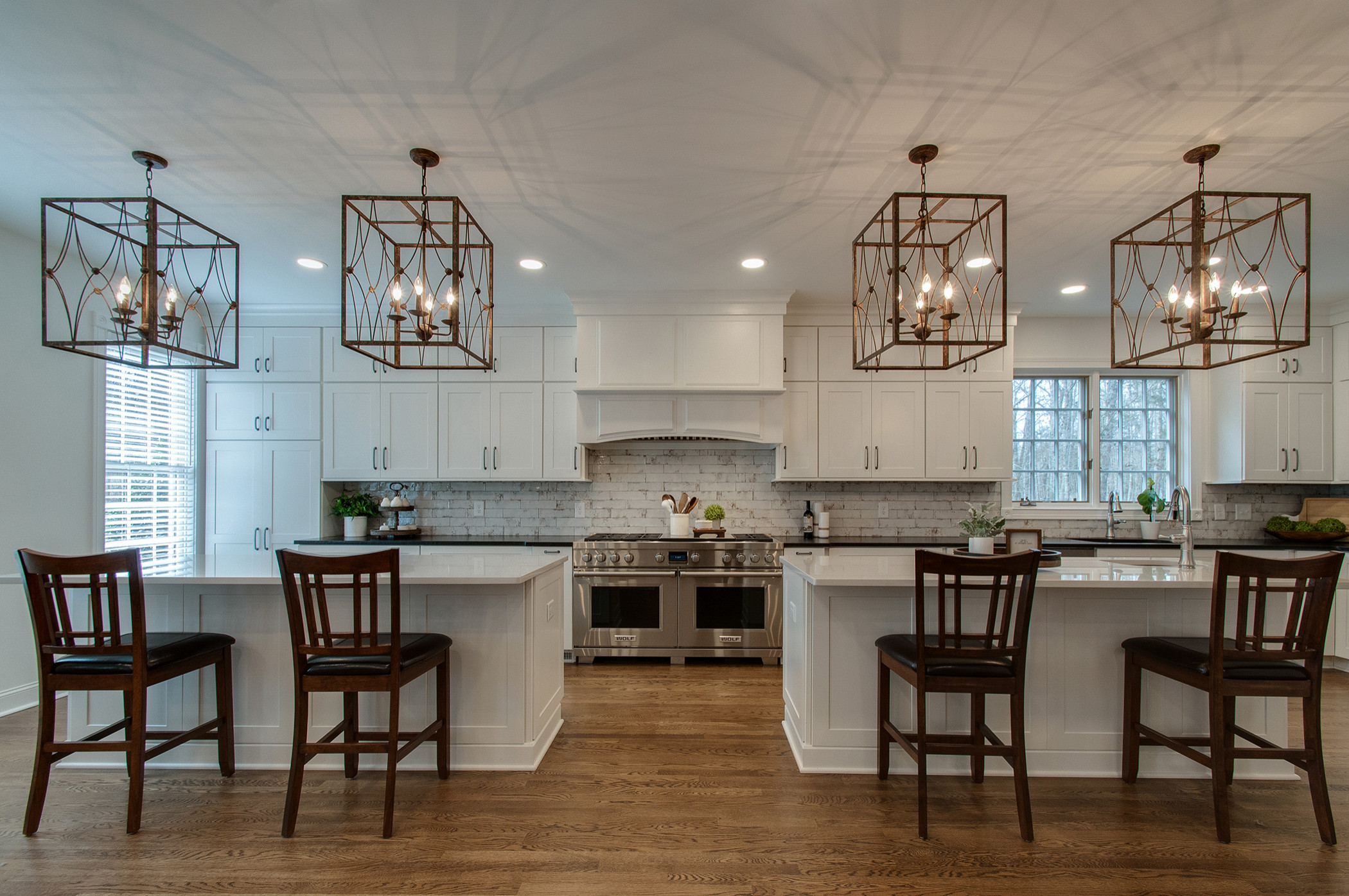
Who: Pamela Standish of Usable Space Interiors
Where: Nashville, Tennessee
In her own words: “I believe being a great designer is about having both strong creative and analytical skills.”
Imagine a fresh, airy room with beautiful flow and where everything has its proper place. This is home bliss for many. A well-designed room can affect your comfort level, mood and efficiency, says Pamela Standish, who owns Usable Space Interiors in Nashville. She helps clients create gorgeous, functional spaces that fit their lifestyle and budget.
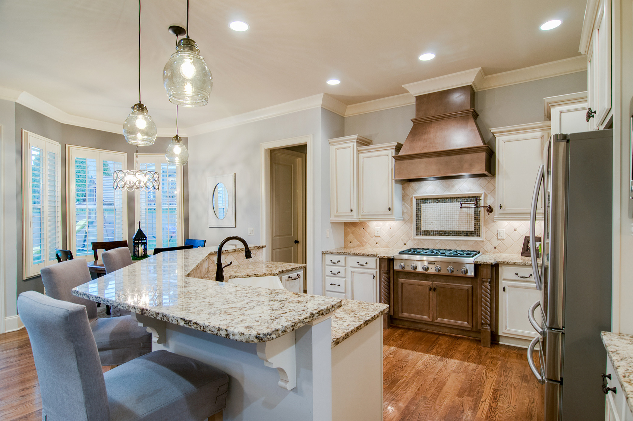
Design DNA. Standish grew up in a family that was focused on design. Her mother was a hair stylist and her father, a commercial printer who analyzed color and balance. “As a young girl, I’d rearrange my furniture, my closet, my drawers from light to dark, organize the bathroom towels, the pantry, you name it,” she says. “I felt very complete creating comfortable, functional spaces.”
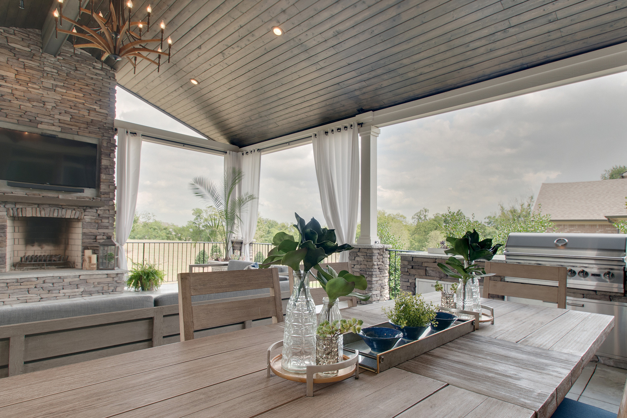
Solving the puzzle. Standish compares home design to a puzzle where all your elements, including budget, have to fit together. “Say that you want a Lamborghini but you only have a Lexus budget,” she says. “You have to think outside the box to find options.”
Part of the puzzle is deciding on how your kitchen or bathroom remodel will fit into the rest of your home. “Don’t spend your whole budget on one or two rooms,” Standish says. “You want to put 20 percent aside for small updates in the adjoining rooms, such as paint or furnishings, that will tie everything together.”
Below, Standish shares some of her tips for a successful home update.
1. Get Space From the Garage
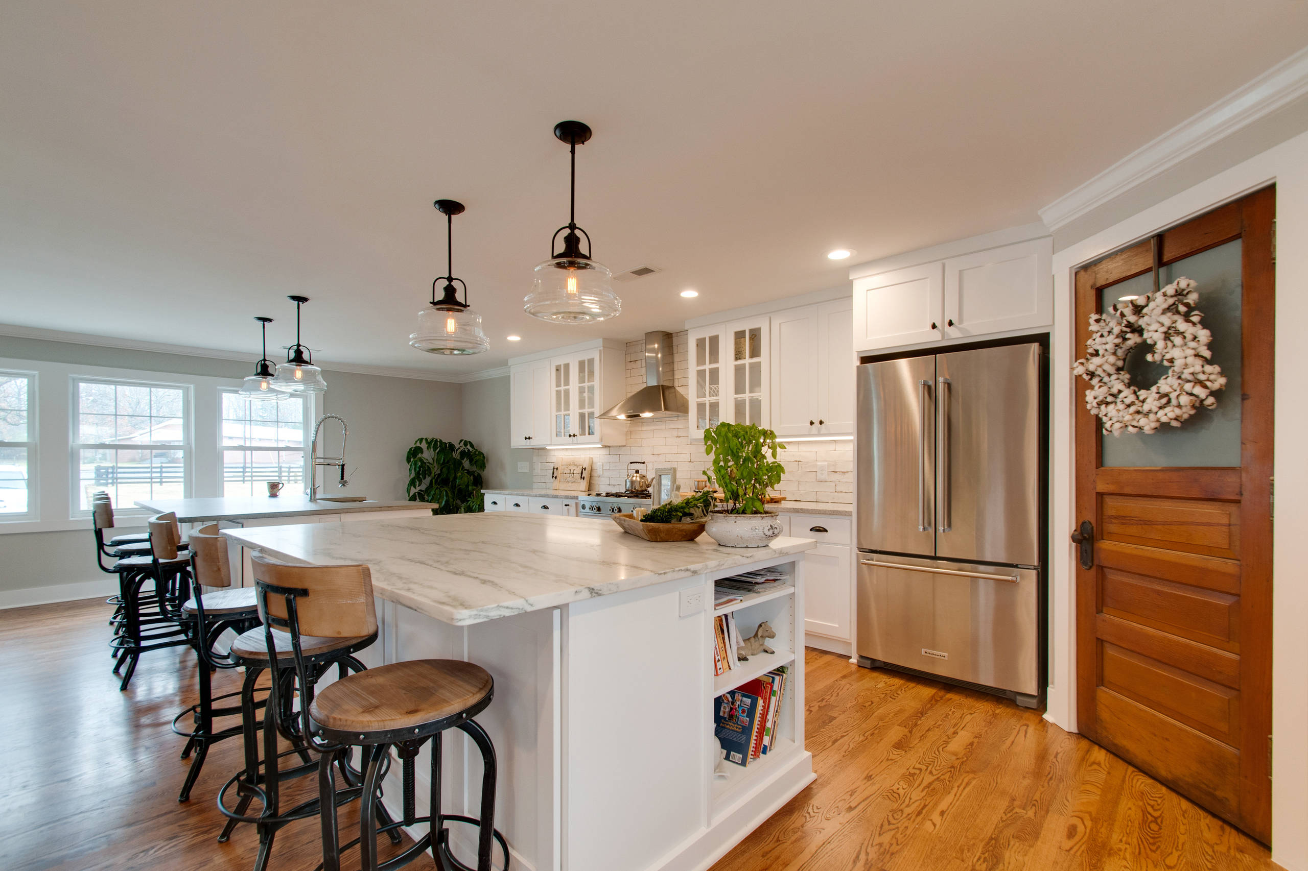
Looking for a way to expand your kitchen? Standish suggests taking a good look at adjoining finished spaces, such as a workroom or garage. “It’s much easier and far less expensive to expand into an existing structure than to add onto your home,” she says. “You’ll save on wall materials and you already have electricity, and possibly gas and plumbing, in place.”
The team enlarged the original kitchen in this Fairview farmhouse by using space from the adjoining garage. “My client had retired and wanted a large kitchen where she could be part of the living-room conversation,” Standish says. “We created a sizable open kitchen with two islands and a pantry.” One island, marble topped, is dedicated to baking and the other, concrete topped, is used for eating.
2. Streamline With Storage
If you do constant battle with clutter, better storage could be key in beautifying your home. The tiny cabinets and cramped closets found in older houses are out of sync with a modern lifestyle, Standish says.
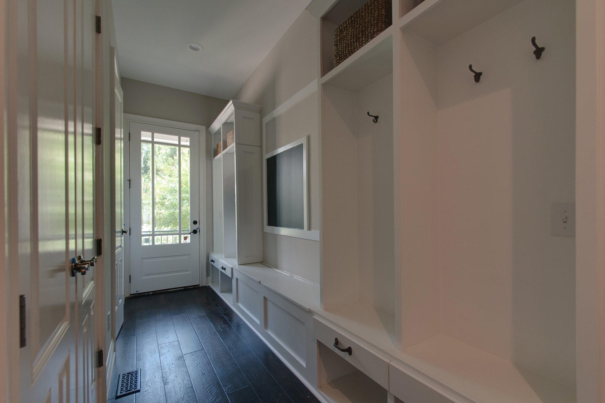
She undertook a complete renovation of this 15-room home in Green Hills, making sure to improve the storage. Though the house was large, angled walls in the kitchen and baths cut off valuable space. The team squared off these areas using 2-by-4s (long, thin wood boards) and drywall, and added taller, deeper cabinetry. They also transformed a side entrance into a family organization center, seen here, with coat hooks, a charging station and a message board.
3. Balance Light and Dark
To brighten an interior room that lacks natural light, use plenty of illumination and mix light and dark elements. “Can lights in the ceiling, with dimmers for control, are the most effective way to add light,” Standish says.
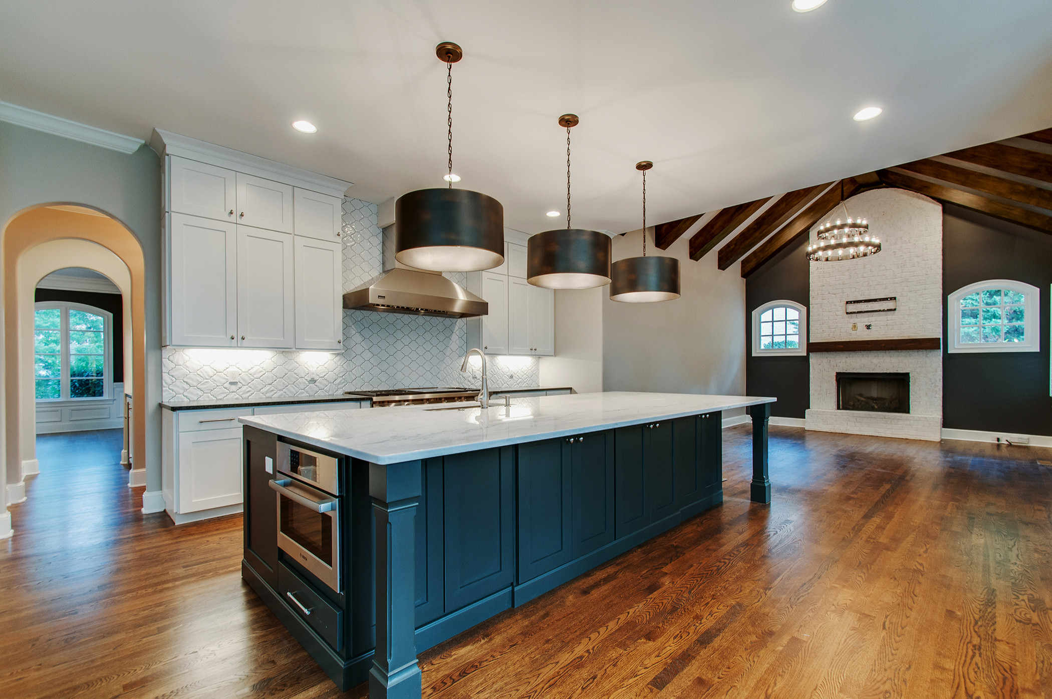
She lightened up this kitchen in Cool Springs using white cabinetry and tile and a pale island countertop. These elements contrast nicely with the darker floors, metallic pendant lights and island base. “The peppercorn gray paint in the adjoining room coordinates with the pendants’ metallic finish and helps connect the spaces,” Standish adds.
More: For more information on Pamela Standish and examples of her work, visit Usable Space Interiors’ Houzz profile.
This story was written by the Houzz Sponsored Content team.
