Houzz Pro Spotlight: 3 Ways to Make the Most of Your Home Renovation
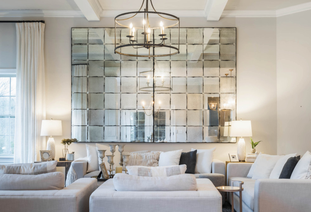
A Nashville designer shares tips to help you achieve your goals with an interior remodel
Who: Pamela Standish of Usable Space Interiors
Where: Nashville, Tennessee
In her own words: “Maximizing space is in my wheelhouse.”
For Nashville designer Pamela Standish, creating spaces that are equally beautiful and functional is her goal with every project. “Interior design is not just about being creative and having an eye for harmonizing color, but also about understanding the big picture, the most minute details and how they tie together,” the owner of the aptly named Usable Space Interiors says.
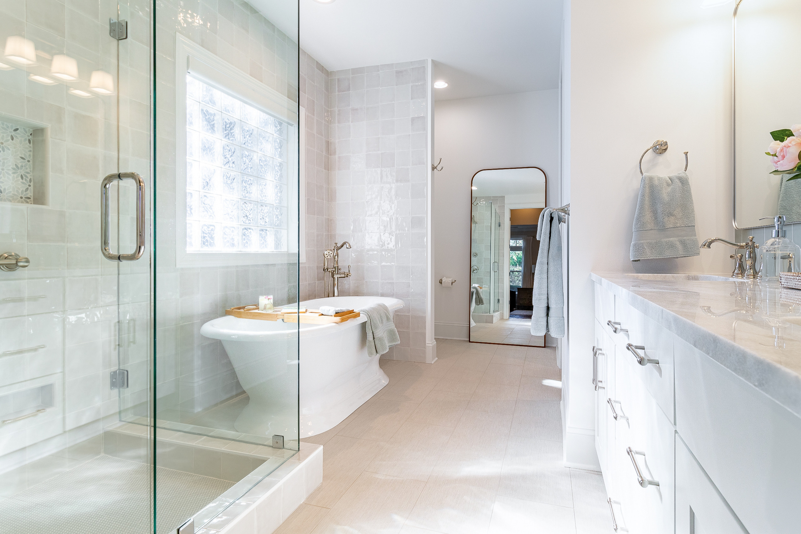
Stay grounded. Standish, who got her design start in childhood when she would regularly rearrange her closet, says the priority of any design is to make it work for how the homeowners live. “Many homeowners have a similar lifestyle to me and use their homes like I do,” she says. She adds that your location will also play a role in your design choices, so embrace that as well. “Someone in Florida will want a more coastal look, while a small apartment in New York city has a different vibe,” she says.
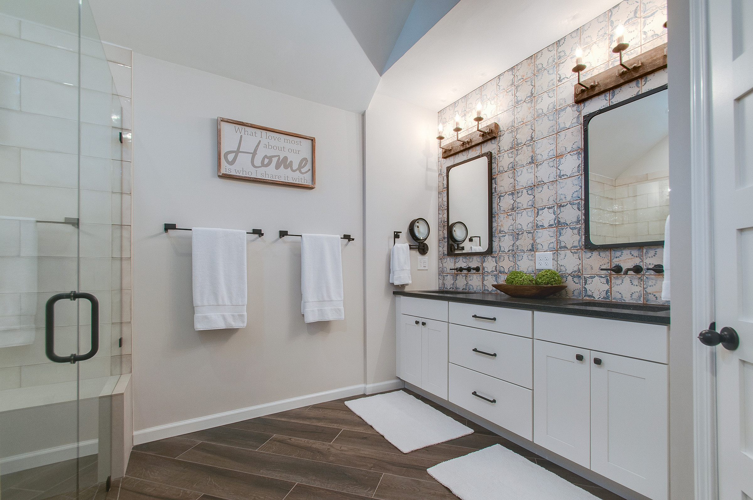
Save by bundling. Standish says that while budget concerns are always in the forefront, sometimes renovating one room makes the rest of the space look outdated. “It’s worth considering making planned changes for an adjacent room at the same time,” she says. Standish points out that the expanded scope often will end up being less expensive than doing things in phases. “There can be an economy of scale for materials and the work,” she says.
Looking for suggestions for your home renovation? Standish has some tips below.
1. Maximize the Available Space
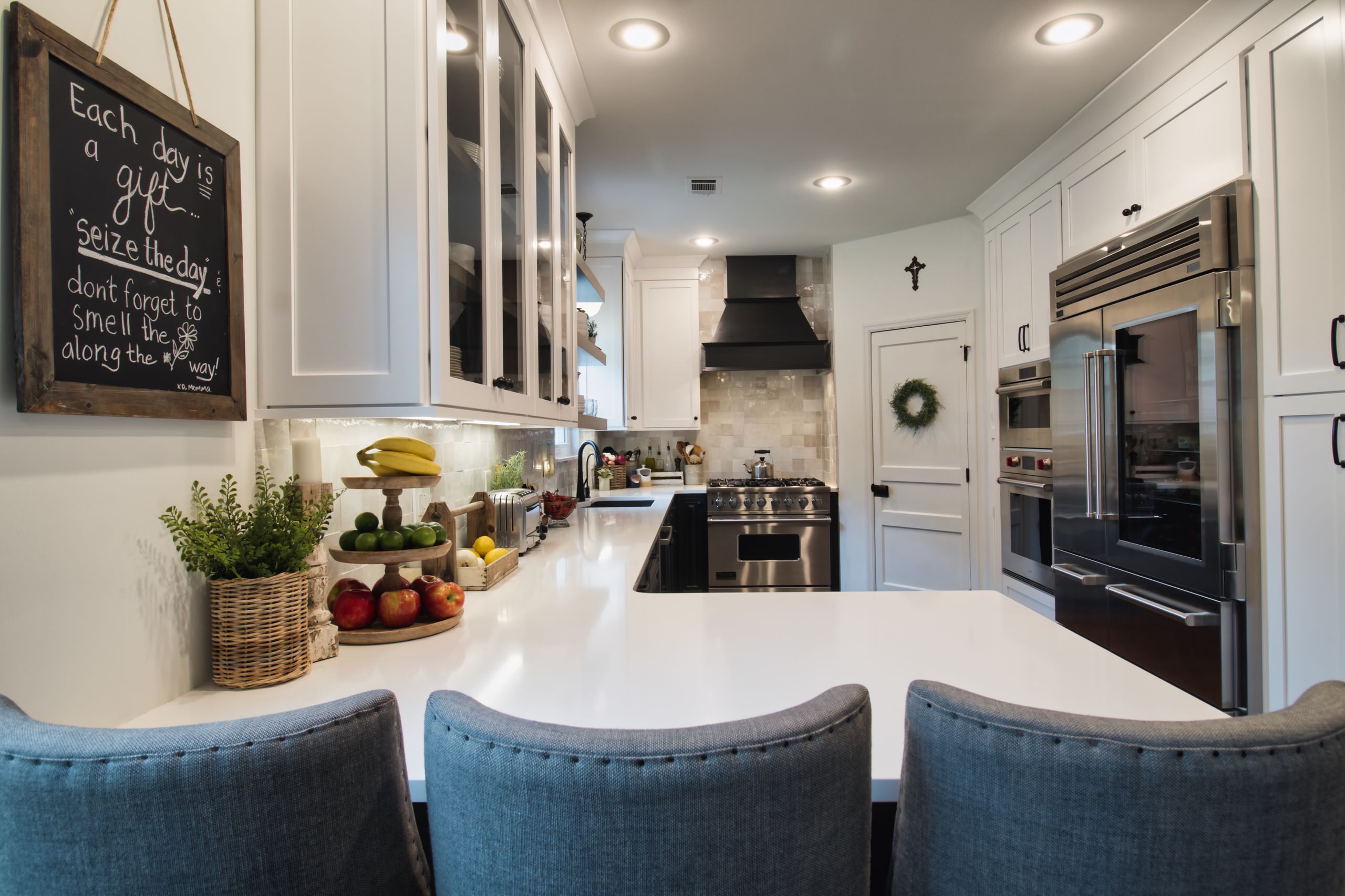
Look for ways to boost the functionality of your space. “A refresh of this Nashville kitchen became a priority when a storm damaged the appliances,” Standish says. Because the size and basic footprint would remain the same, she focused on improving the functionality within the layout.
Removing an unused desk and moving a wine rack to the adjacent dining space provided enough room for a larger refrigerator and a steam/wall oven combo. Standish also extended the upper cabinetry to the ceiling and added multiple towers with rollouts for appliances, serving dishes and a TV/computer combo. Floating shelves near the sink create a more open feel. A large spice cabinet now sits next to the stove and there’s a sliver of a nook next to the pantry for a hidden step stool. A new backsplash adds timeless style.
2. Eliminate Barriers
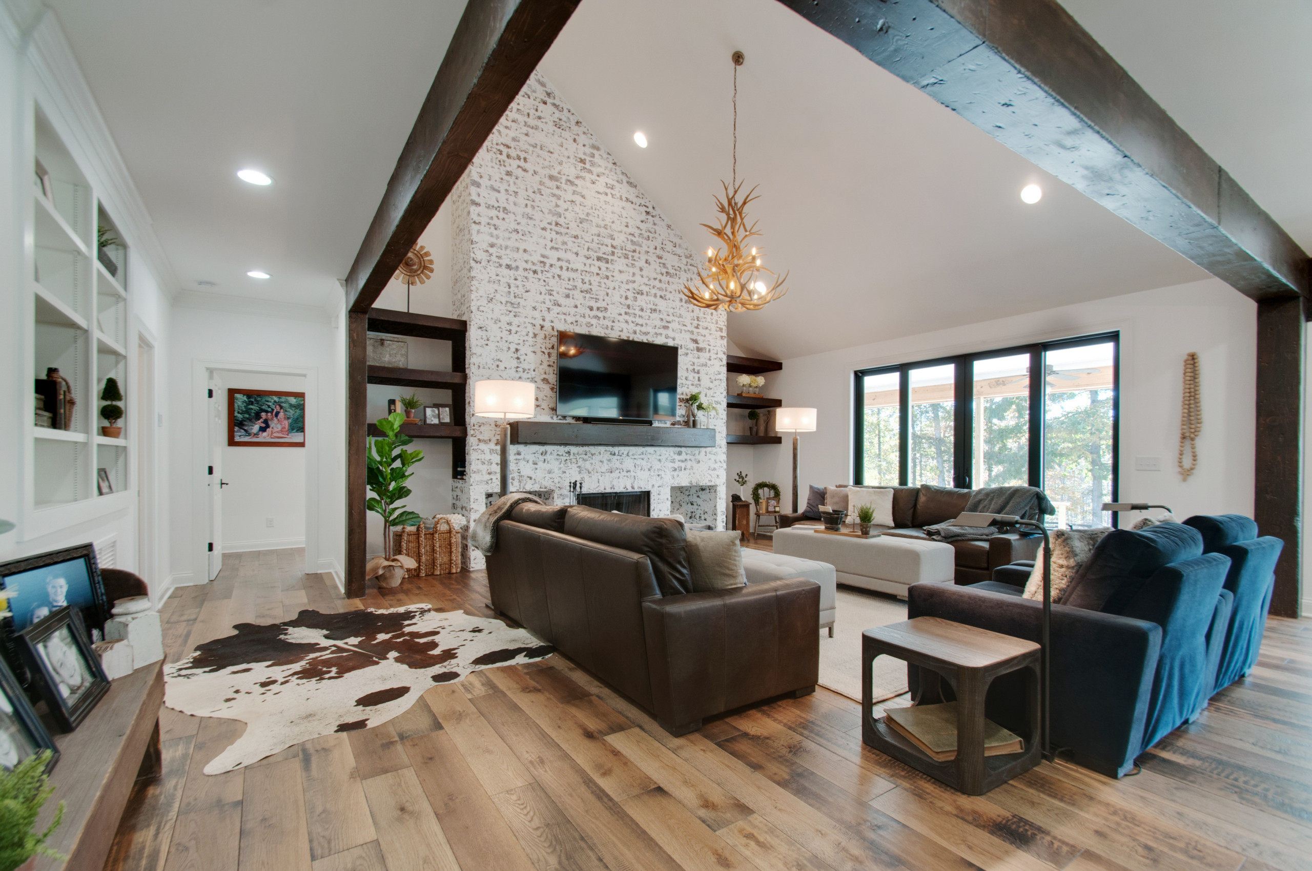
Remove posts and unnecessary walls to open up a space. “This home at this Leiper’s Fork farm was a good size, but bulky pillars and closed-off spaces made it feel cramped,” Standish says.
Removing the large pillars in the living room and replacing them with overhead beams opened up the room, creating an airy feel and allowing enough space for generously sized furniture. The adjacent kitchen also was changed, with a new large work island and space for multiple cooks. The dining space now overlooks the farmland and can easily accommodate the six adults who gather there for lunch.
3. Add Some Bells and Whistles
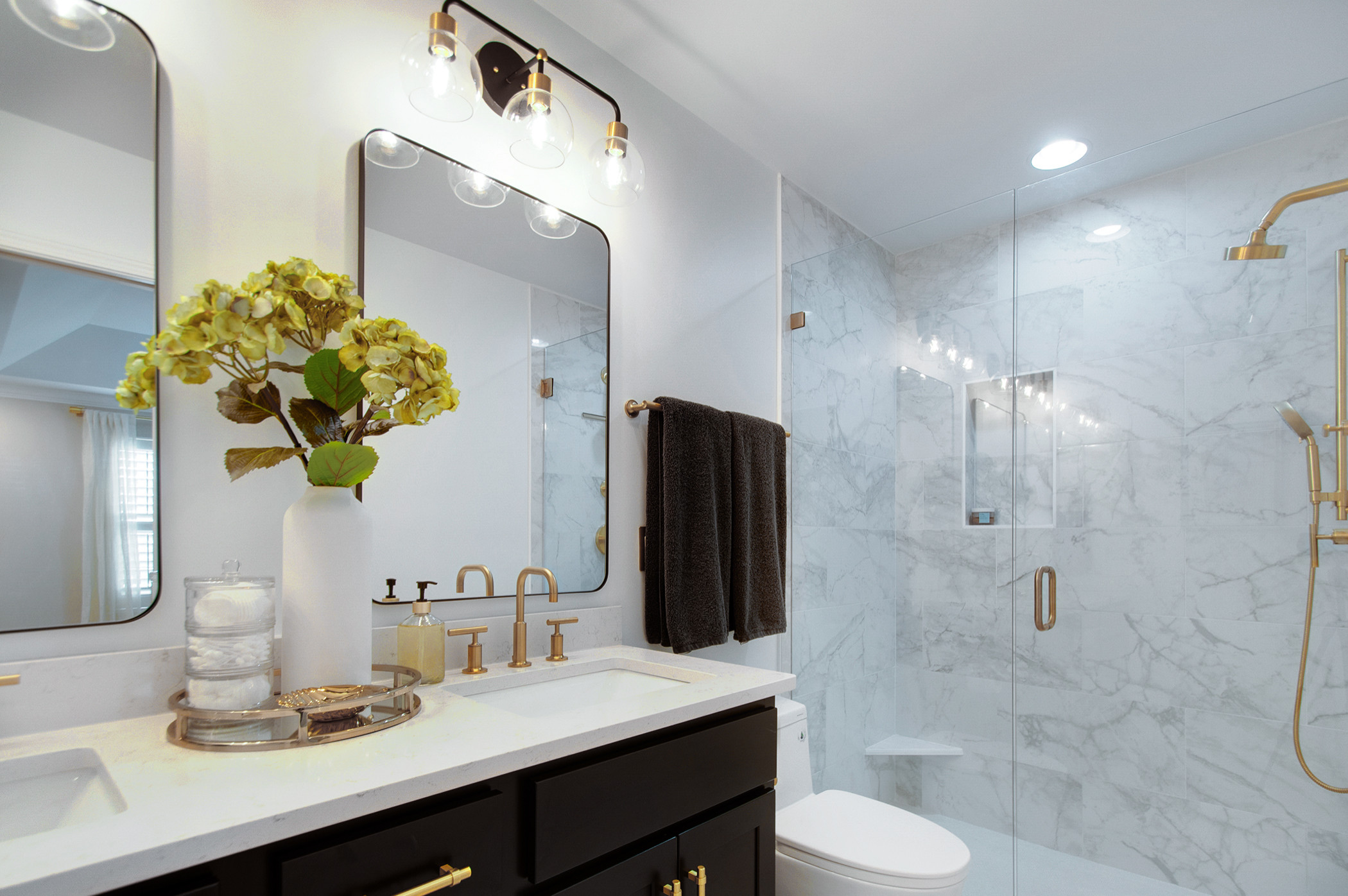
Include details that may seem small but increase functionality and style. “For the owners of this smaller home in Franklin, we created innovative ways to make the most of their space,” Standish says. She also gave them the midcentury modern vibe they were looking for.
In the primary suite bathroom, Standish removed the bulky bench, then added a niche in the wall and a footrest at one end, resulting in a more compact and elegant look. She updated the rest of the room with white finishes, a sleek new vanity and gold highlights to give the room fresh style. Other extras throughout the renovation include a custom spice drawer in the kitchen and a “doggie zone” under the stairs, complete with a pot filler for the water dish.
More: For more information on Pamela Standish and examples of her work, visit Usable Space Interiors’ Houzz profile.
This story was written by the Houzz Sponsored Content team.
